React Portals
Mar 17th, 2018
Today I look at the new React portals feature that allows you to render modals outside of the parent component.
React portals were recently added in version 16, this enables you to render children outside of the parent component.
Portals provide a first-class way to render children into a DOM node that exists outside the DOM hierarchy of the parent component.
What's so great about that? Well the most common use cases are going to be components that need to be rendered at a top level but also need to retrieve props from nested parents, a good example is a modal.
So how do you use this new feature? lets render a modal with React portal...
<!-- index.html -->
<html>
  <body>
    <div id="modal-root"></div>
    <div id="app-root"></div>
  </body>
</html>
// Modal.jsx
export default class Modal extends React.Component {
componentWillMount() {
this.modalRoot = document.getElementById('modal-root');
}
render() {
const { show, children, backDropClick } = this.props;
if (show) {
return ReactDOM.createPortal((
<div className="backdrop" onClick={backDropClick}>
<div className="modal" onClick={e => e.stopPropagation()}>
{children}
</div>
</div>
), this.modalRoot);
} else {
return null;
}
}
}There are a few extras in here that we'll discuss later but the main part is what we're returning if props.show is true.
ReactDOM.createPortal has two parameters the first is a "renderable React child" most commonly a html element or react component in this case our modal markup, the second parameter is a DOM element to render the former in which is a div with the id of "modal-root" from our index.html.
Pretty easy right? simply return the ReactDOM.createPortal method with the content and where you want to render it!

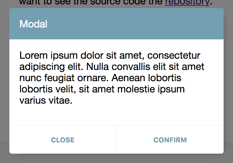
So how to create a modal? it depends on the style your after but I'm going with a simple centered box to render a card with header, message, action buttons. It will also need a backdrop that makes the modal "pop off" the screen.
So back to those extras you may have noticed in the example. We have the backdrop, a div with the class of "backdrop" that's styled the following way.
.backdrop {
  position: fixed;
  top: 0px;
  bottom: 0px;
  left: 0px;
  right: 0px;
  background-color: rgba(0,0,0,0.5);
  padding: 16px;
  z-index: 250;
  display: flex;
  align-items: center;
  justify-content: center;
}
This makes it behave as a full screen dark translucent overlay that uses flexbox to center it's children on both axis.
The other part onClick={backDropClick} is a function passed as a prop that gets called when the backdrop is clicked, in the demo I use it to close the modal by altering the prop passed as show to be false.
On to the modal itself which is simply styled to contain it children to a specified dimension.
.modal {
  width: 100%;
  max-width: 350px;
  max-height: 200px;
}
Because we want to reuse modal it simply contains the children prop so that it can be composed with any other components in a modal instance.
It does have a "onClick" attribute onClick={e => e.stopPropagation()} this is to stop click event bubbling up to the backdrop so now you can click the modal or its children without it closing from props.backDropClick.
Right! we've created the modal component now we just need to implement it around the app. Here I have created an example of how you might do that.
/* SomeComponent.jsx */
export default class SomeComponent extends React.Component {
  constructor(props) {
    super(props);
    this.openModal = this.openModal.bind(this);
    this.closeModal = this.closeModal.bind(this);
    this.doSomething = this.doSomething.bind(this);
    this.state = {
      modal: false,
    };
  }

  openModal() {
    this.setState({ modal: true });
  }

  closeModal() {
    this.setState({ modal: false });
  }

  doSomething() {
    alert('You did something!');
  }

  render() {
    return (
      <Fragment>
        <button onClick={this.openModal}>Do something</button>
        <Modal show={this.state.modal} backDropClick={this.closeModal}>
          <Card title="Modal">
            <CardContent>
              <p>Are you sure you want to do something?</p>
            </CardContent>
            <CardActions>
              <CardAction label="Close" onClick={this.closeModal} />
              <CardAction label="Confirm" onClick={this.doSomething} />
            </CardActions>
          </Card>
        </Modal>
      </Fragment>
    );
  }
}
In "SomeComponent" we need to use a modal to confirm a user action, so we import and use the modal component, use local state to control the "show" prop and give the "backDropClick" prop a method to set the show state to false. Then we pass what we want to display for the modal, in this case a custom card component that has some actions that we can use to cancel or confirm.
You may have noticed I used a Fragment component, if you haven't seen this before don't worry it's just a way of returning a single component that doesn't add additional markup it is not required and you can use whatever you like, you can read more about it here.
And there you have it, using React portals to render modals from anywhere in your application! please check out the demo and code for this post for further inspiration including using react-motion to add some smooth animations!